What do you think? Share your thoughts.
What do you think? Share your thoughts.
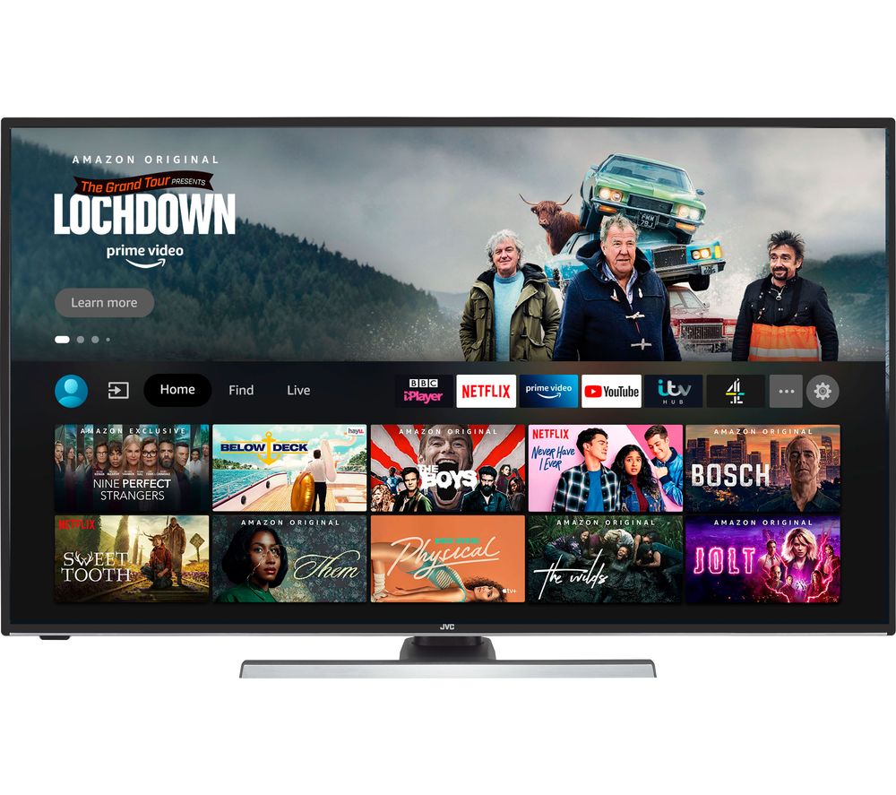
Kinda reminds me of the Fire TV UI
I was just getting used to the new UI on my Shield, the only gripe is Showtime, which I dont use and cant remove. No matter how many times I remove it from the customization screen, the moment that app gets a minor update, it pops right back and I have to remove it again.
I just hope the "play next" feature is still there. It's really convenient when you watch shows across a few different apps.
Where is "Music" tab ?
Oh, i forgot Google's music service is YT Music...
It looks just like Hulu to me
Depends on what I can move around. I don't need top picks anywhere in my face. Favorites need to remain where I want, not where they want.
It doesn't look all that different at this level . It's got some minor differences in the menus at the top. It depends on what's going on "under the skin".